An Interview with Web Designer Mike Fallows
Building the information super-highway
The internet… it’s pretty big these days, isn’t it? The so-called information superhighway has gone from being a quiet country lane to a fully-fledged six-lane autobahn, and is showing no signs of slowing down.
But this rapid development didn’t just happen on its own—behind all those fancy websites there’s a slew of hard-working web designers, building the brave new world one line of code at a time. Mike Fallows is one of them.
For the last 20 years he has combined technical know-how with a keen creative eye, weaving digital dreams for people like Oi Polloi, Seen, Stan Ray and Millican.
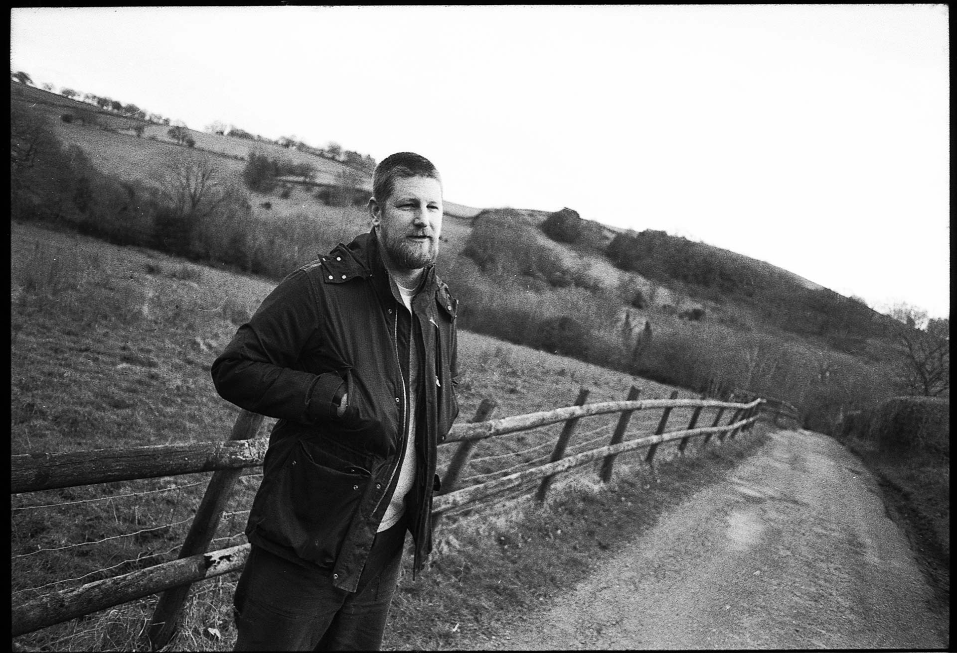
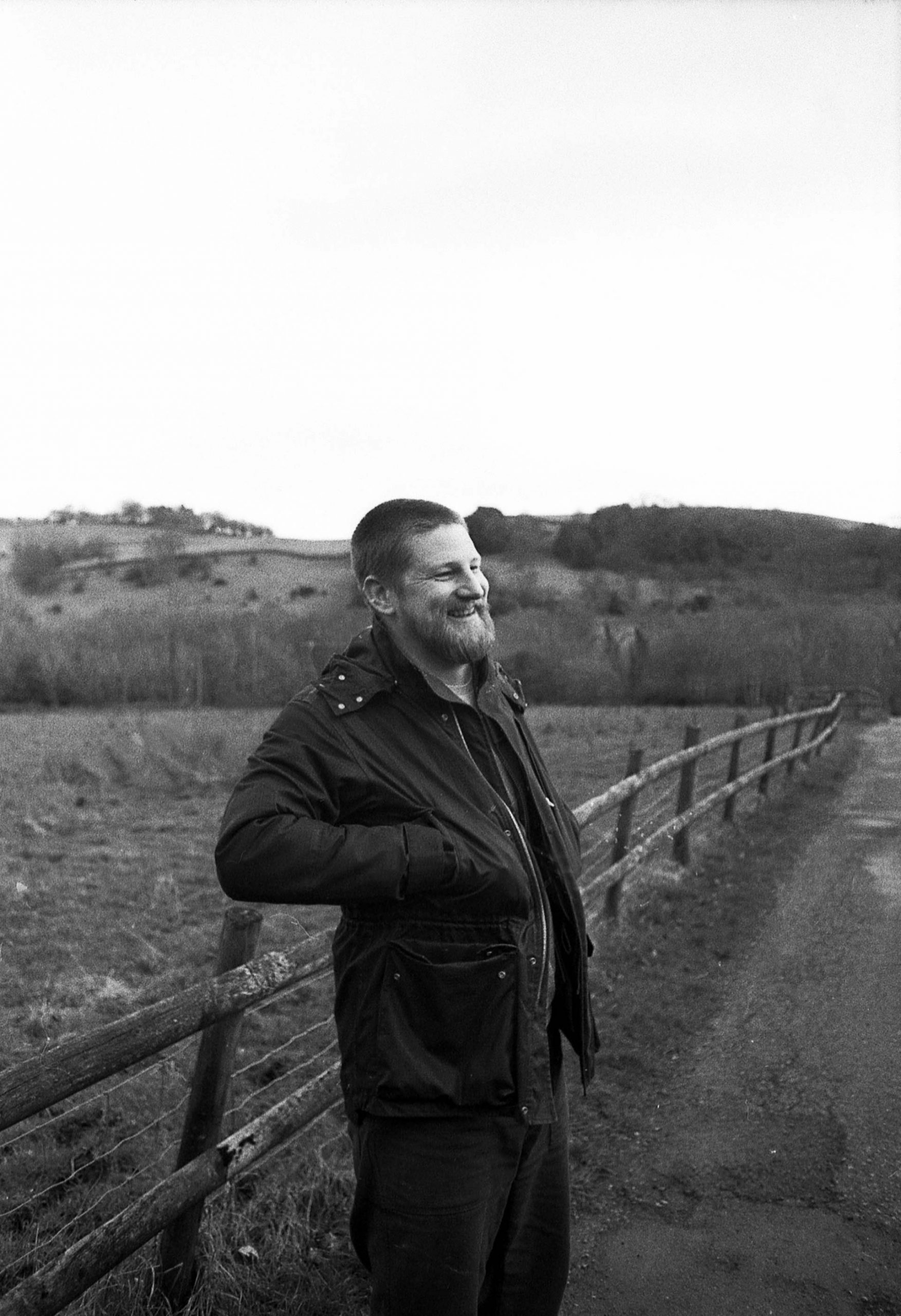
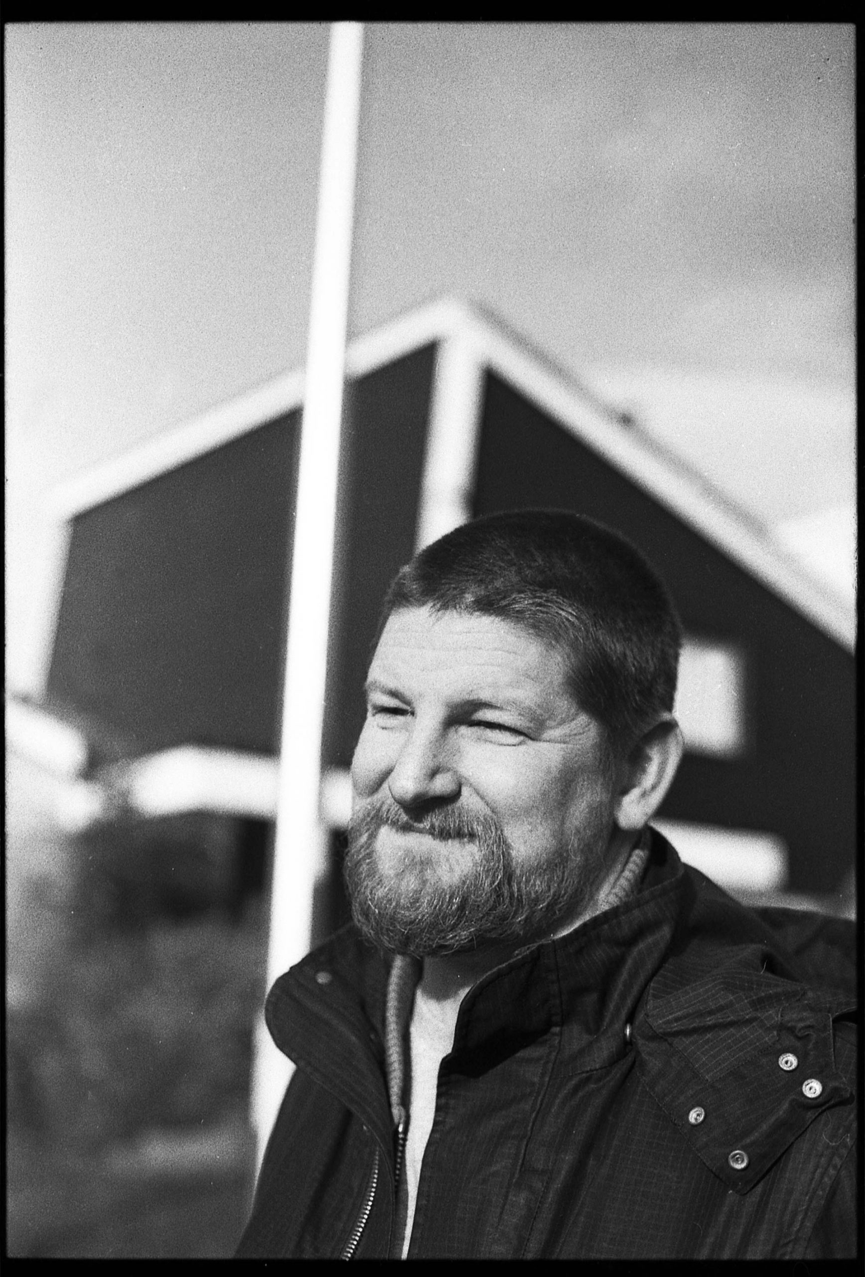
We met up with him in the physical world to discuss the place they call cyberspace.
Starting things off, what got you into designing websites in the first place? Were you messing around with computers a lot as a child?
Yeah, I suppose so. My mum bought a word processor when I was about six or seven, and there was always a computer in the house from then on. She also bought me my first iMac when I was on my degree so it’s not really a coincidence that those circumstances, or privileges, meant I got a head start with computers.
I studied illustration at Preston, and there was a lecturer there who had done some sound art stuff with Flash—like Adobe Flash, or Macromedia Flash at that time—and she showed us how to make a website. And weirdly I’d gone to Venice with my girlfriend and her family, and the Biennale was on—and there was a load of net.art there—there was this interesting movement of people using Flash to build websites as art.
What year was this?
It must have been 2001. A lot of this went along with the electronic music I was into at the time—this weird experimental stuff.
And at that time there was a big multimedia movement too. Musicians and film-makers were doing a lot with CD-ROMs.
Yeah, you’d get a CD-single, with the video embedded onto it. There was an album that Ninja Tune put out by a band called Hexstatic, that was like a CD-Rom video album. It was all very new.
Even though I was on the illustration course, which should have been in the same building as advertising and graphic design, they were re-doing the building, so they chucked us in this place that looked like a prison with the music department. My girlfriend at the time was doing a music course, so I just made loads of mates who were doing music—I didn’t really chat to the people doing illustration. They wanted to set up a record label, so one of them bought a domain name from a shop near the campus, I figured out how to put up a web-page, and that was basically it—suddenly I was the guy who knew how to do websites.
I’d think, “I’d love to design record sleeves,” but it was always, “Can you do a website?” I wanted to make record sleeves, but there was no money for that, whereas people would pay me to make a website. And that just meant I never really got a job. It was just around that time that people started realising that if you had a business, you needed an online presence. It was 100% about timing. Even though I’ve always done quite a bit of graphic design as well, I think that the fact that I could have an existence, without getting a proper job, was down to building websites.
How were you making them back then?
There was another bit of Macromedia software called Dreamweaver that made it really easy. In your interview with Ben and Nick, they talked about doing the listings for Night and Day, and I don’t know how it came about, but that was one of the first websites I built. It had the functionality for them to enter the details of the events that were coming up, do their own admin, and publish listings onto the home-page. And it was just built on Dreamweaver, so you didn’t really have to understand software engineering—you didn’t really have to know that much. It didn’t work much differently to Photoshop—if you could just figure out how to get it online, and get a domain-name to point to it, that was it. I wouldn’t want to look at it now, it’d be terrible—but there probably weren’t any other live venues that had their listings online, and could send emails out. Everything was still quite novel then.
The other thing was that I moved to Manchester and I got a part-time job at Boomkat—and they were pretty advanced for e-commerce. They had their own platform built, and they were listing a lot of records.
Subscribe to our newsletter
It wasn’t just a placeholder website with an address and a phone number on it?
Yeah—it was a whole system that listed hundreds of records, with sound-clips. And it sold really obscure stuff, so it couldn’t just work for Manchester—it made a big difference that they could be online.
I think the whole thing about putting stuff on the internet is still fascinating—it’s still magic that you can put something on there, and even if there are five people visiting, they might be five people from five different countries. Before I started university I was living in a small village in the Lake District. I might have been able to get a copy of The Face or Jockey Slut, and know a little bit about what was going on elsewhere, but there was no way of knowing anything about this culture outside of maybe somewhere in Barrow hopefully stocking a magazine. Whereas the internet meant I could start buying weird records, even though I lived in the back of beyond.
It opened things up. Suddenly you’re not relying on one-off trips to cities or mail-order.
You’d have to buy The Wire magazine, look up somewhere, and then do some mail-order directly from the record label—and not that there was anything wrong with that, but there’s a huge amount of friction there versus going down to a record shop and actually having access to all the stuff that was there. And these days, there’s Spotify and everything—I don’t know if it’s better or worse? Has it completely levelled out culture so much that there’s less of these pockets of things happening? When I first moved to Manchester, it felt like things were still location based.
And it’s nice to have the hunt too. I’m not sure if you appreciate things as much if you can get it in the click of a button.
I guess that’s why people buy old records now? My dad rolled his car the other day—and he’s fine, but his car was a write-off, and the thing he was most bothered about was that he had a Tanita Tikaram CD left in the CD player which he’d forgotten to get out. But he can just go on Amazon to get another, it’s completely replaceable. There was a certain time when if something was gone, it’d kind of be gone.
It’s not that long ago, but I suppose it’s hard to remember how basic the internet was back in the late 90s. A band might have had a website, but it’d just be a few photos.
The other place I helped out at was Twisted Nerve, and I think they’d just won an award… maybe a Brit or something… for Best Website, beating Warp and a few other big guns. The Twisted Nerve site was really good. They did all this cool gimmicky stuff—there’d been earthquakes in Manchester for a bit, so they made their homepage do that jiggly thing when you loaded it. Because the guy, ‘Gary Website’, was in there full-time, he’d hand-craft every page. And just seeing that, and how you can have fun with a website, made me realise it could be as interesting as a flyer or a record sleeve.
That sounds more like how a magazine would layout different articles differently, rather than how now most websites have a set template which every article or product fits into.
Back then, you didn’t really have a choice, you had to build each page by hand. I say by hand, but they’d be filling in these templates—it hadn’t hit that Web 2.0 thing where there’s forms on the site that you put things in, and it’s spat out on the other end. In the old days, it wasn’t that dissimilar to doing a fanzine.
I think the whole thing about putting stuff on the internet is still fascinating—it’s still magic.
But yeah, what was gained in efficiency—being able to list a load of stuff really quickly—was probably lost in serendipity. If you’re going to make each page individually, there’s more of an opportunity to do something a bit daft with each one. When you require things to be a bit formulaic, you have to work harder to make things a bit more unusual. But even though now there’s maybe not a huge amount you can do with websites, you can still have fun with them, and so long as you can do a bit of that, you can at least demonstrate there’s a human behind it.
At Boomkat I was just packing records and uploading files, but I got to see a little bit about how it worked. Because I was only working part time, I’d do these little bits for people, the site for Night and Day, or a website for a sign company.
And around that time the internet was getting faster, and it wasn’t just for people who were into computers anymore.
Yeah, there was that time when iMacs came out, and iPods came along and it wasn’t a rare thing to have a computer at home. Around that time I got some work for a company which did mobile web—do you remember WAP? When that came along, you got these first mobile sites, which were sub-domains with lists of links. Because the sites were really small, you basically just hand-built them. There was a set of restrictions, which made them quite interesting.
Because I worked for that company, they had all this stuff about how that was going to explode, so I then got into the whole responsive web-design, building stuff for mobile. You talk about people having personal computers, but now there are way more hand-held phones. Who buys a desk-top computer anymore? You get an iPad or a little Chromebook—they’re all portables. So that whole thing about building for smaller devices with smaller screens, I think I was quite early into that.
Why don’t more designers get involved in websites? It seems it’s still very much its own thing.
It’s quite a hard thing to wrap your head around. When we talk about how there are these similarities with print—how you’re maybe doing a version of print, online—there are maybe some concepts that do transfer, but the problem you’ve got to solve is so different. You have to take a lot of things into consideration with web design these days. It’s definitely a different skill.
It’s kind of unique in the way you’ve got no control over where it ends up. When you print a book or a magazine, you decide it’s going to be on this paper, or it’s going to be black and white—you’ve made all those decisions up front, so you know what the end result will be. But when you do a website, you’ve got no control over how it’s going to be accessed—it could be through a PlayStation or a phone. And if you’re a traditional print designer, it’s hard to configure your brain to think about it that way.
It’s got to last for years too—even though you don’t know what device is going to come next. I think that’s probably why the websites that do quite well don’t have much flavour to them. That earthquake thing I was talking about, you couldn’t do that now as it wouldn’t work on half the devices, whereas then, there were maybe three browsers and one screen size.
Yeah, that website Homer Simpson designs wouldn’t work these days. A lot of that early-web quirkiness would be lost in translation.
To do something that bespoke you have to find all these edge-cases, but how do you check all them? You kind of have an educated guess. It’s really fun to do it, if you get the chance to do it well, but otherwise you can be battling against the restrictions.
Where do you see websites going?
It’s more about brands—whereas before with e-commerce you’d have a multi-brand shop, now it’s so easy for a brand to have its own store. It used to be quite hard to set-up an online shop—it was a big investment. But now, if you’re a brand, you’re already taking the product photos, you already know what your marketing strategy is, and you don’t need to rely on a retailer to do the work for you. The shame about that is you lose what you get from the multi-brand retailers—that choice or direction.
I suppose people are maybe more switched on now. They do their research, so maybe they don’t rely as much on being introduced to brands through bigger shops.
Yeah. I think before, you kind of had no choice. If you wanted imported things, you weren’t going to find a website in your language‚ but you could go to a store. But I guess now, if people are a bit switched on, they can go direct. I also wonder if that thing of brands not wanting to compete with their retailers is less of a thing now.
Especially over the last year, with physical shops closed, brands will have had no choice but to get a website together and sell their stuff themselves. At a time when every company has a website, how do you make one that stands out? What does a website need to offer?
There’s a risk of blandification, isn’t there? It’s so easy to get onto the internet and trade, but I think where retailers have an advantage is that they know how to sell stuff. If we talk about clothes, for example, there’s a culture around it. People aren’t really paying just for the garment, there’s a bit more to it. You can still have loyalty to a retailer.
Even if it’s just a website? Can you have loyalty to code?
Yeah, because there’s still people behind it. You still want to buy stuff off people who are cooler than you. If I want to buy good outdoor gear, I want to get it from people who go outdoors all the time—that’s who I’m going to trust. Maybe the key is being able to demonstrate it—you might be an expert outdoors-person, but you’ve got to prove it. And if you’re really good at that, you’ve engendered someone with trust. You can be a chancer, but you’ll get sniffed out eventually.
I suppose maybe it’s the same fundamentals as a physical shop, or making a physical magazine—it’s about trust and authority.
Yeah, and I think you’ve still got to run a shop. I think that’s where there is sometimes a bit of difficulty—if you’re a brand, of course you can set up a web-site and let people buy, but there’s more to selling stuff than that. I’ve worked in shops, and I know there’s a bit more to it than just having a door that people can walk in, and a till that you can sell with. It’s not just ‘build it and they will come’.
You need to demonstrate that it’s not just a money-making exercise—it’s not Tesco’s self-check-out.
If the website is like the shop-fitting, then the content is like the sales stuff. How do you talk about the product? Does it sound like you’ve just ripped off some sales copy, or does it sound like someone’s actually seen the product they’re selling and think it’s worth selling?
When I was selling records I could always sell records I liked better than the records I didn’t, because I could genuinely be enthusiastic about them. That enthusiasm has to shine through—so you do have to think about how you’re going to photograph the product, and think about the kind of language you use to write about it. And whether you’re doing blog posts, or getting people to do mixes and you’re putting on events—you need to demonstrate that it’s not just a money-making exercise. It’s not Tesco’s self-check-out.
There’s got to be more to it than just buying things.
Unfortunately for you, it’s quite hard for me to put this into words—it’s still a bit nebulous to me. What I like about e-commerce is how direct the results are. You do something, and there’s an instant result, more or less. But there’s another bit that’s a bit more esoteric, that’s a little bit harder to measure, but it’s probably more important.
I’ll buy something from a really crap website, but if it’s sincere and it feels like the people behind it are genuine, I can get over that threshold. I’ve bought records from shops before that I could have bought easier from another shop, but I kind of wanted the bag.
Sometimes it’s more about the experience of going there.
Yeah—it’s almost like a tourist experience. And you can still have that with an online shop, it’s just that’s maybe about the packaging it comes in, or the handwritten note that comes with it, or that they just had the great article about the film you really love. It’s like, “These guys are into it.”
I suppose we’re talking about websites for fairly emotional or sentimental stuff anyway—buying records or clothes isn’t the same as buying plumbing supplies. I don’t expect articles on 80s horror films when I’m shopping for washing machine seals.
Yeah, these things have a big culture around them. Maybe I overthink it, but I think there are just a lot of cues that trigger why you’d want to buy something, and where you want to spend your money.
You mentioned the numbers or statistics aspect of websites before. Do you think reading too much into that can have a negative effect? Does it make the internet more dull because of the constant feedback you get on it?
I think you can make the mistake of only reacting to things you can directly measure. There are some things that can be harder to measure. Sometimes it’s kind of bananas that you might want to write an article about an 80s horror film to sell something, because is that going to move the needle—is that going to sell more baseball caps? Directly, no—but indirectly—probably yes.
And it feels like people have finally realised that. Every brand is creating their own articles now.
There was a time when SEO was the biggest thing you could do—but for a brand, or somewhere with an exclusive set of brand names, search isn’t really your big problem. Your big problem is convincing someone they should buy a coat from the other side of the world. With content marketing, you can compete against bigger sites by being really specific, and also you can appeal to those people who don’t want to buy from a big website—people who’d rather buy from somewhere off the beaten track—or feel some sort of affinity with the people they’re buying from.
Does all this make it hard as a web-designer—there are a lot of boxes a website needs to tick?
It’s about it being appealing, and maybe distinguishing yourselves a little bit from the competition… and looking cool—as pathetic as that sounds—it’s got to be interesting. The reason why I like record sleeves is probably the same reason I like cool websites—it’s the packaging, rather than the product.
As someone who’s been designing websites for nearly 20 years, has the internet turned out as you’d imagined it would have back then?
Well, I would like to think I could have predicted how much sales stuff was going to go online, but what I do think is interesting are these businesses that are online only—and don’t just replicate what you’d do with a physical store.
The reason why I like record sleeves is probably the same reason I like cool websites—it’s the packaging, rather than the product.
I work with a company called Eat Well who deliver a lot of meals to people who’ve been affected by the pandemic—supplying these chef-made meals—and to generate their income for that, they’ve set-up an online store where they sell meal-kits from local chefs and restaurants, and that’s really interesting. The challenge is how they can deliver that. It’s not as simple as just selling t-shirts—there’s a bit more complexity in how you organise selling fresh goods like that.
It’s a really novel idea, and in the past the technology would have stood in the way. People can set these things up without having to spend hundreds of thousands of pounds, and they can react fast to things like the pandemic. And that’s one of the big differences to when I started—you had to invest a huge amount of time and effort into even just selling online, whereas now—it might take a week. I don’t think I’d have ever thought it’d be that easy.
I suppose we’ve talked about the internet for a while now. Have you got any wise words to finish this with?
Absolutely not.
Alright, we’ll end with a different question—if someone’s going to design a website, what should it have?
A homepage? Or maybe a Yoshi that walks across the bottom? But yeah, as naff as it sounds, what was nice about the Myspace and Geocities stuff was that it was a lot more playful. I don’t use social media much, but I don’t think it’s that interesting that on Facebook you’ve just got a profile picture and a header, and that’s about as fun as you can make it. As crappy as Myspace was, it was just bananas. These days it’s a shame there isn’t a little bit more of that. Being a bit daft shows the human side of things, and I think that’s been sanded away a bit by everything being on a giant platform that’s so generic looking.
