Stuff We Like: Old Patagonia Catalogues (Part 2)
More classic catalogue imagery from the boundary-breaking outdoor brand
Yep, we’ve already written about Patagonia’s old catalogue design, but after a quick gander on the amazing Outdoor Recreation Archive, we quickly realised we’d barely scratched the surface. So here’s more.
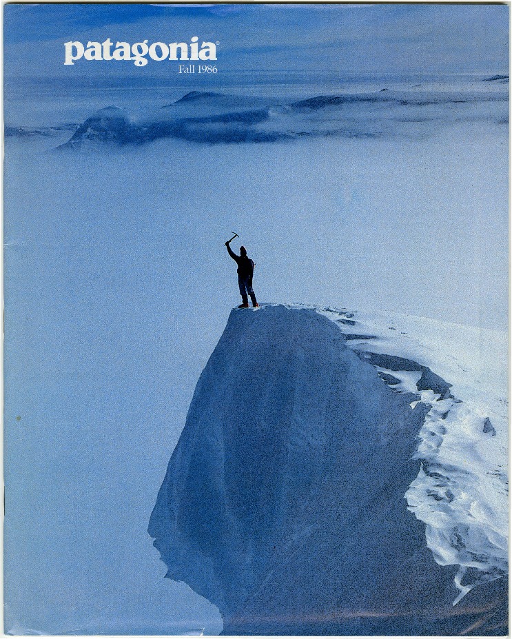
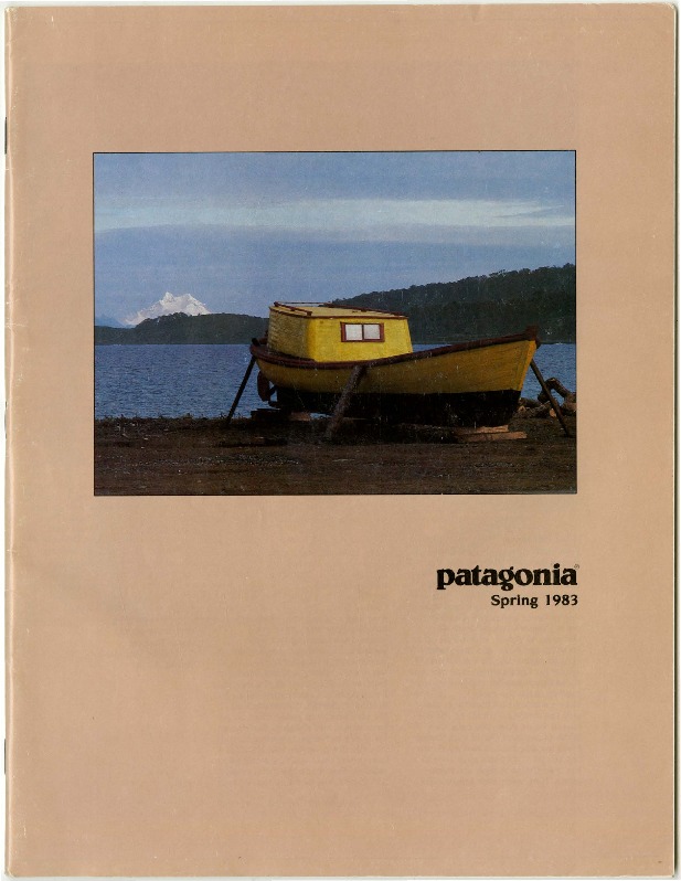
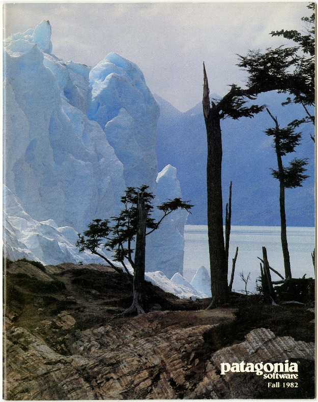
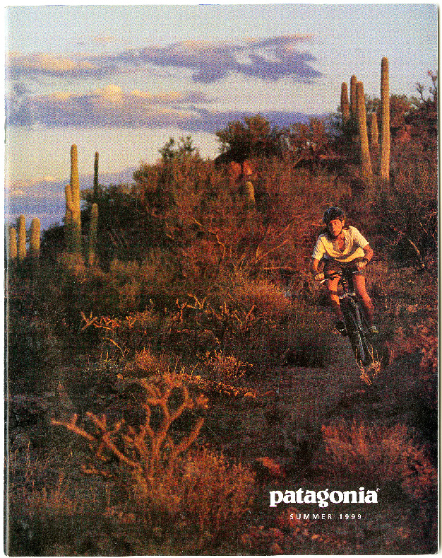
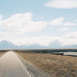
With the winning combination of amazing photography shot on rich transparency film, that instantly recognisable lower-case logo (the typeface is apparently called Belwe, if you were wondering) and not much else, these catalogue covers (mostly from the 1980s) prove there’s something to that old ‘less is more’ adage.
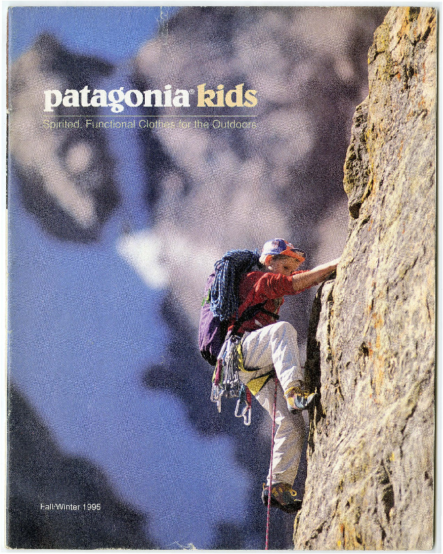
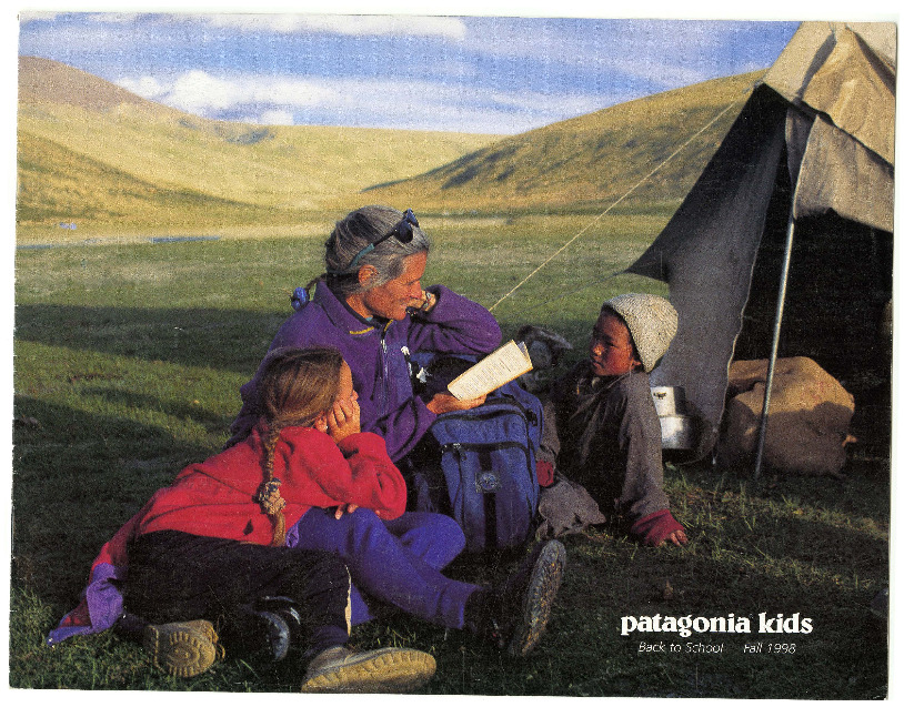
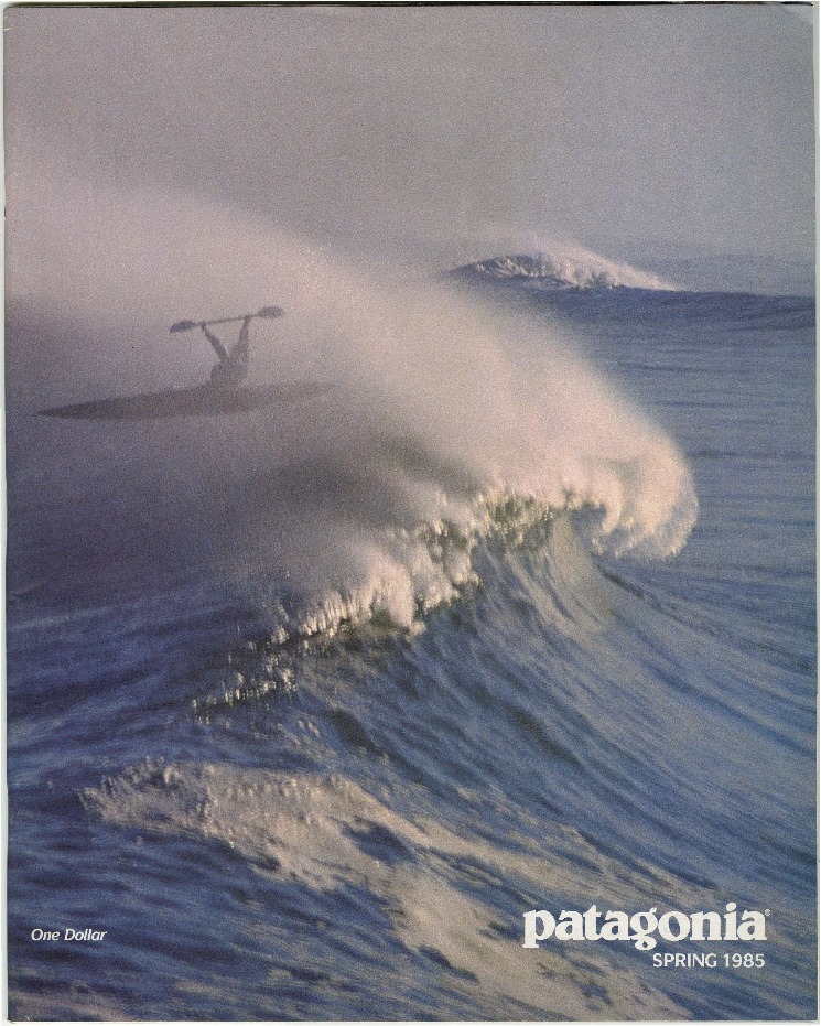
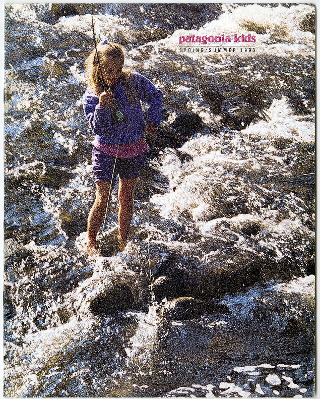
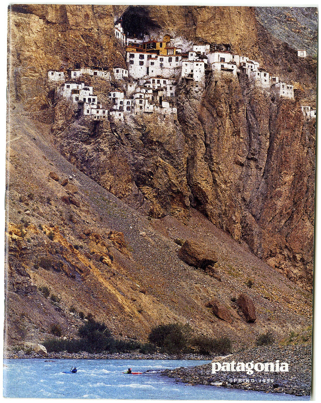
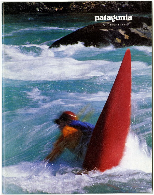
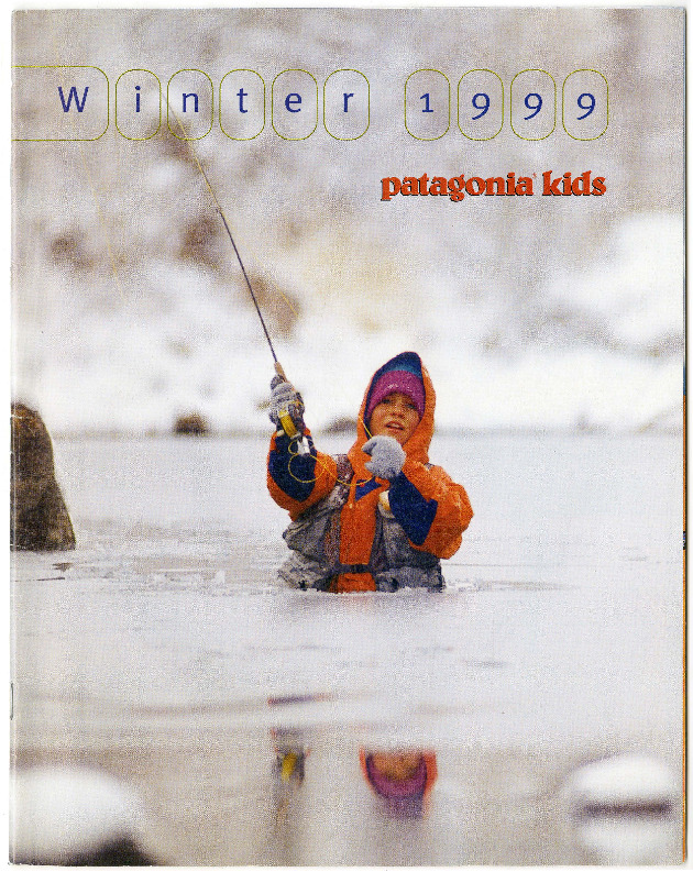
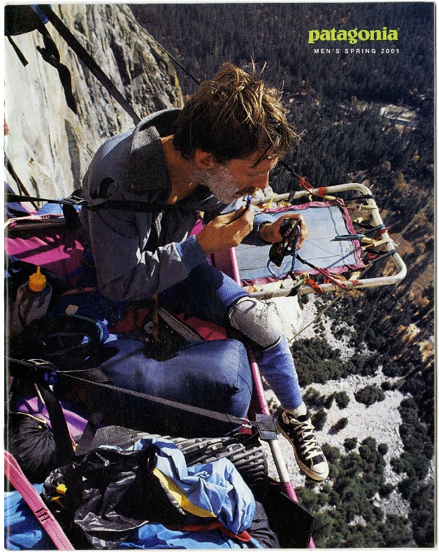
Images taken from the Outdoor Recreation Archive.
Read our interview with Patagonia Europe’s marketing manager Jelle Mul here.
